
ghostbusters sign history and meaning
The blog delves into the iconic ghostbusters sign, exploring its origins, design elements, cultural impact, and modern interpretations. Initially designed in 1984 by Michael C. Gross for the film’s visual identity, the sign combines a playful ghost with the universal “no” symbol. Its simple yet effective design has transcended the movie, becoming a cultural icon recognizable globally. The blog addresses key questions about its design evolution, technical specifications, and preservation efforts, highlighting its lasting relevance. Additionally, it discusses modern adaptations and the ongoing influence the sign has due to its universal appeal and identifiable features. Understanding its legacy helps appreciate its continued significance in popular culture, even in digital and contemporary formats.
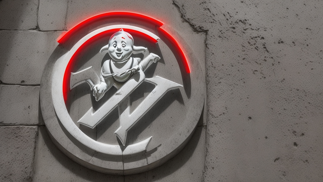
# The iconic ghostbusters sign: unraveling its legacy **Table of contents** – [Origins and development](#origins) – [Design elements decoded](#design) – [Cultural impact](#impact) – [Modern interpretations](#modern) – [Behind the scenes](#behind) – [Technical specifications](#specs) – [Preservation efforts](#preservation) – [Future of the sign](#future) ## Origins and development {#origins} The ghostbusters sign emerged in 1984 as a crucial element of the original film’s visual identity. The iconic crossed-out ghost design came from initial sketches by designer Michael C. Gross, who wanted something instantly recognizable yet simple enough to become a lasting symbol. The ghostbusters sign combined a playful ghost character with the universal “no” symbol, creating an immediately understandable visual message. [Learn more about ghostbusters images and their history](https://stefhan.ai/ghostbusters-images-and-their-history/) ## Design elements decoded {#design} At its core, the ghostbusters sign consists of three main components: the cartoon ghost, the red circle, and the diagonal line. The ghost character features a friendly, almost cherubic expression, making it more approachable than scary. The bold red circle and slash create the prohibition symbol, following international standards for warning signs. ## Cultural impact {#impact} The ghostbusters sign transcended its movie origins to become a widely recognized cultural icon. Its influence spans decades, appearing on merchandise, in advertising, and as inspiration for countless parodies. The sign’s effectiveness lies in its universal appeal and instant recognition across different cultures and languages. [Read about how ghost bot functions](https://stefhan.ai/ghost-bot-explained-and-how-it-works/) ## Modern interpretations {#modern} Today’s versions of the ghostbusters sign maintain the original’s core elements while adapting to contemporary design trends. Digital renderings offer enhanced detail and dimension, while maintaining the classic silhouette that fans know and love. The sign continues to evolve through fan art, official merchandise, and digital media. ## Behind the scenes {#behind} The creation process involved multiple iterations before reaching the final design. Early versions experimented with different ghost expressions and proportions. The team settled on the current design for its perfect balance of humor and authority. ## Technical specifications {#specs} The standard ghostbusters sign maintains specific proportions: the ghost occupies roughly 60% of the inner circle space, while the red circle and slash follow standard warning sign specifications. These measurements ensure consistency across different applications. ## Preservation efforts {#preservation} Various organizations work to maintain the integrity of the original ghostbusters sign design. Digital archives preserve early sketches and development materials, while trademark protection ensures proper usage in commercial applications. ## Future of the sign {#future} As the franchise continues, the ghostbusters sign remains relevant through digital adaptations and new media formats. Its simplicity ensures it will stay effective in future applications while maintaining its classic appeal. **People also ask about ghostbusters sign** **What materials were used for the original ghostbusters sign?** The original film props used painted acrylic and metal components. Modern reproductions typically employ vinyl, plastic, or digital printing methods depending on the application. **How has the ghostbusters sign changed over time?** While maintaining its core design, the sign has adapted to include subtle refinements in detail, color gradients, and dimensional effects, especially in digital formats and modern merchandise. **Where can I find official ghostbusters sign specifications?** Official specifications are maintained by Sony Pictures and licensed manufacturers. Standard dimensions and color codes ensure consistency across official products and promotional materials.
# The iconic ghostbusters sign: unraveling its legacy **Table of contents** – [Origins and development](#origins) – [Design elements decoded](#design) – [Cultural impact](#impact) – [Modern interpretations](#modern) – [Behind the scenes](#behind) – [Technical specifications](#specs) – [Preservation efforts](#preservation) – [Future of the sign](#future) ## Origins and development {#origins} The ghostbusters sign emerged in 1984 as a crucial element of the original film’s visual identity. The iconic crossed-out ghost design came from initial sketches by designer Michael C. Gross, who wanted something instantly recognizable yet simple enough to become a lasting symbol. The ghostbusters sign combined a playful ghost character with the universal “no” symbol, creating an immediately understandable visual message. [Learn more about ghostbusters images and their history](https://stefhan.ai/ghostbusters-images-and-their-history/) ## Design elements decoded {#design} At its core, the ghostbusters sign consists of three main components: the cartoon ghost, the red circle, and the diagonal line. The ghost character features a friendly, almost cherubic expression, making it more approachable than scary. The bold red circle and slash create the prohibition symbol, following international standards for warning signs. ## Cultural impact {#impact} The ghostbusters sign transcended its movie origins to become a widely recognized cultural icon. Its influence spans decades, appearing on merchandise, in advertising, and as inspiration for countless parodies. The sign’s effectiveness lies in its universal appeal and instant recognition across different cultures and languages. [Read about how ghost bot functions](https://stefhan.ai/ghost-bot-explained-and-how-it-works/) ## Modern interpretations {#modern} Today’s versions of the ghostbusters sign maintain the original’s core elements while adapting to contemporary design trends. Digital renderings offer enhanced detail and dimension, while maintaining the classic silhouette that fans know and love. The sign continues to evolve through fan art, official merchandise, and digital media. ## Behind the scenes {#behind} The creation process involved multiple iterations before reaching the final design. Early versions experimented with different ghost expressions and proportions. The team settled on the current design for its perfect balance of humor and authority. ## Technical specifications {#specs} The standard ghostbusters sign maintains specific proportions: the ghost occupies roughly 60% of the inner circle space, while the red circle and slash follow standard warning sign specifications. These measurements ensure consistency across different applications. ## Preservation efforts {#preservation} Various organizations work to maintain the integrity of the original ghostbusters sign design. Digital archives preserve early sketches and development materials, while trademark protection ensures proper usage in commercial applications. ## Future of the sign {#future} As the franchise continues, the ghostbusters sign remains relevant through digital adaptations and new media formats. Its simplicity ensures it will stay effective in future applications while maintaining its classic appeal. **People also ask about ghostbusters sign** **What materials were used for the original ghostbusters sign?** The original film props used painted acrylic and metal components. Modern reproductions typically employ vinyl, plastic, or digital printing methods depending on the application. **How has the ghostbusters sign changed over time?** While maintaining its core design, the sign has adapted to include subtle refinements in detail, color gradients, and dimensional effects, especially in digital formats and modern merchandise. **Where can I find official ghostbusters sign specifications?** Official specifications are maintained by Sony Pictures and licensed manufacturers. Standard dimensions and color codes ensure consistency across official products and promotional materials.